Pure Source Dairy
Client
Pure Source Dairy
Year
2026
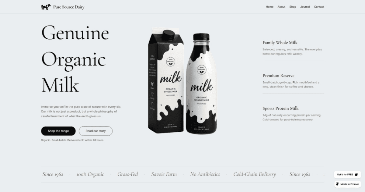
Pure Source is a quiet, restrained template for organic and small-batch food brands who don't need to shout to be trusted.
Built around a fictional single-herd dairy in the French Alps, it's designed for founders who want something cooler and more editorial than the usual "handcrafted rustic" look that dominates the food and beverage template category — every design decision, from the muted stone-and-sage palette to the serif/sans type pairing, was made in deliberate contrast to that aesthetic.
The Problem
This one started smaller than it ended up. I came across a hero section on Figma Community that stopped me mid-scroll — clean, well-composed, the kind of thing worth studying rather than just admiring. I set out to recreate it as a design exercise. Partway through, it stopped feeling like a copy exercise and started feeling like the beginning of a real project.
That single hero section became the seed for something much bigger: a full seven-page ecommerce brand, and an opportunity to actually publish something on the Framer Marketplace — one of the clearest ways to establish a creator presence there, but only if the work is good enough to stand next to what's already selling. The organic/food-and-beverage category already had a strong entry: All Natural, a warm, illustrative template built for natural food and beverage brands. Submitting something generic into that same category would get lost next to it.
The brief I set for myself, once the project outgrew its starting point: build a template in the same category that could genuinely compete — different enough in tone and execution to be its own thing, not a knockoff, and polished enough (structurally, visually, and in the copy itself) to hold up to real marketplace scrutiny.
My Role
I owned this end to end: brand strategy and positioning, the full competitive audit, all copywriting (brand voice, product descriptions, journal content, SEO metadata), the visual design system (color, typography), and the Figma-to-Framer build — page structure, CMS collections, and the UX/storytelling flow connecting every page.
Outcome
A seven-page template (Home, Shop, About, Journal, Contact, individual Product and Journal detail pages, 404) built around a fictional single-herd dairy brand, Pure Source, with:
A complete design system (Fraunces/Inter type pairing, muted stone-and-sage palette) distinct from All Natural's warmer, more illustrative look
CMS-driven Products, Testimonials, and Journal collections, rather than hardcoded content
A full SEO and metadata layer across every page, keyword-researched specifically for the organic/small-batch dairy niche
A "Trace Your Bottle" transparency feature tying the brand's core claim (single-herd sourcing, no blending, no additives) directly to a verifiable set of details — farm location, herd breed, feed, milking schedule, bottling and delivery windows
How I Solved It
Starting from a spark, not a blank page. The original Figma Community hero section gave me a visual starting point, but nothing beyond it — no brand, no product line, no story. The real work was everything that had to be built around that one section to make it into something worth submitting: a full identity, positioned deliberately rather than assembled from whatever felt nice.
Positioning first, pixels second. Before going further on layout, I identified All Natural as the direct competitor and made a deliberate choice to go the opposite direction — cooler, more restrained, more editorial, rather than trying to out-warm an already-warm template. That decision shaped every choice that followed: the type pairing, the color palette, and the tone of every line of copy.
Building a brand that could survive scrutiny, not just look good. Early drafts of the brand's core claim leaned on vague language — phrases like "we don't scale" — that sounded nice but didn't hold up under a second read. I reworked the central claim into something concrete and checkable: every bottle traces back to a single herd, with nothing blended in from elsewhere. That single change did double duty — it made the copy more credible, and it gave the "Trace Your Bottle" feature an actual claim to prove, rather than a mood to gesture at.
Setting had to match the story, not just look nice. The brand's original setting (Normandy) got swapped mid-project once alpine photography was chosen for the site's visual identity — Normandy's coastal, lowland geography didn't match alpine pasture and mountain-hut imagery. I relocated the brand to Savoie, in the French Alps, which brought a real, usable detail into the story: transhumance, the actual alpine practice of moving cattle to high summer pasture and back to valley barns in winter. That one geographic decision ended up strengthening the brand story rather than just fixing a mismatch.
Chasing down the details that don't survive a second look. A template like this lives or dies on internal consistency — and small things kept surfacing that needed active reconciliation:
A "48 hours, pasture to door" headline claim that quietly broke once you added up bottling time plus delivery time separately — fixed by tightening the delivery window so the full chain stayed inside the promise
A product description that had genuinely lovely detail ("fleur de sel from the coast") sitting next to a brand story built entirely on single-region alpine sourcing — resolved by naming an actual French salt region instead of leaving it vague
Three different spellings of "non-homogenized" across seven product pages, and two products independently inventing an unbuilt "returnable glass" program — the kind of thing that reads fine in isolation and falls apart under a careful buyer's eye
Writing copy for two audiences at once. Every page had to work as a believable dairy brand and function as a professional marketplace listing — which meant keeping "Template" language out of the on-page copy entirely, while making sure it showed up exactly where a buyer or search engine would need it: page titles, meta descriptions, and category tags.
What Shipped
Full site architecture: Home, Shop, About, Journal, Contact, dynamic Product and Journal detail pages, 404
7-product range with full descriptions, priced and categorized (Everyday / Small-batch / Post-training / Churned / Limited)
3 full journal posts, each grounded in a real dairy technique (vat pasteurization, non-homogenization) rather than generic lifestyle content
Complete SEO/metadata layer: page titles, meta descriptions, and site-wide settings, built from actual keyword research into the organic/small-batch dairy niche
A working design system ready to hand off cleanly to a template buyer, including CMS collections instead of hardcoded content
What Worked / What I'd Do Differently
What worked: deciding on a clear positioning contrast (cooler vs. All Natural's warmer aesthetic) before writing a single line of copy. Every later decision — palette, type, tone — had something concrete to check itself against, instead of being adjusted by feel.
What I'd do differently: I'd lock the brand's core logic (the single-herd sourcing claim, the setting, the timeline math on bottling and delivery) before writing any product-level copy, rather than after. Several of the fixes in this project were the result of finalizing top-level story decisions late and then finding the ripple effects in copy that had already been written — workable, but slower than catching it upstream.


Pure Source Dairy


